Creating digital stories that resonate and inspire

Tag: Marketing

Are Business Cards Dead?

Are Business Cards Dead?

Business cards date back to the 17th century when they were used to announce the arrival of a distinguished guest to the keepers of an estate. Although a networking event isn’t exactly the announcement of your arrival in an elegant horse-drawn carriage, a business card can still work in your favor.

Many people have mixed feelings about business cards. Some people contend business cards are dead with the younger and tech-savvy generation preferring to exchange information on Twitter or connect on LinkedIn. They claim business cards are the last vestiges of the era of paper and print.

I maintain those people are wrong.
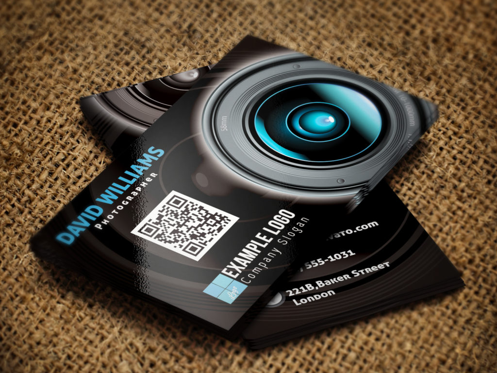
Business Card with QR CodeContrary to popular belief, research has shown that the business card is far from waning. Business cards may be small, but their impact is huge. A business card plays an important part in making a lasting impression upon those you do business with. In fact, business cards are evolving in style and design and catering to the needs of entrepreneurs. Research has also shown that a large majority of people still hand out business cards and people on the receiving end still find them useful.

Despite living in a digital world, business cards can be critical to the development of your business. These small but effective tools that are often handed to customers and prospects can be a highly personalized form of marketing. A well-organized and aesthetically appealing business card can make a better impression than any website address or social media account, which can easily be lost in translation.

Reasons Why You Should Have a Business Card

They Create a Solid First Impression

Business cards should be part of your self-introduction. These eye-catching 3.5 x 2-inch pieces of heavy-duty paper contain all the vital contact information needed to capture your prospect’s attention and help you remain in their memories well after your initial meeting. Today, contacts also expect business cards. They can enhance your credibility and legitimacy and give your prospect a better sense of your professionalism.

They’re Direct Marketing Tools

No other form of marketing is more effective than face-to-face communication coupled with a handshake. Business cards can go wherever you go, making them an essential marketing tool that can facilitate the process of establishing and maintaining new clients for future business opportunities. You never know when you’ll run into a potentially valuable prospect, so you should always be prepared. By keeping a stack of business cards on-hand, you’ll always be ready to market you or your business when the opportunity arises.

They Help Build a Brand

Business cards are a simple way to establish your brand, which in turn makes either you or your business more easily recognized. A successful card should contain your company’s logo, advertising slogan, and necessary contact information, including a phone number, website address and email where you can be easily reached. Remember that just because your business card is made from paper doesn’t mean it can’t also be tech-savvy. Many business owners now use QR codes on their cards that can be scanned by a smartphone to direct customers to the business’s website or social media page.

They’re Budget-Friendly

One of the biggest advantages of a business card is its affordability. Businesses can print business cards for less than it costs to produce other types of marketing materials, such as commercials, press kits, and product samples. When the price is so low and can be easily fit into any business budget, why not always keep business cards on hand? A business card is an excellent way for a business to gain momentum with an attention-getting design.

One of the worst mistakes a business owner can make is to misjudge the importance of a quality business card to brand identity and business development. It can act as your first impression and directly reflect how potential prospects and customers look at your business. While there’s no denying online marketing has become a popular tool for business professionals, traditional marketing still remains strong.

What Information Should Go On a Business Card?

Business cards serve many purposes, but their primary purpose is to tell what you do and give the recipient a way to contact you. Don’t leave off the information the recipient needs most.

At the very least a name and contact method (address or phone number) should go into a business card design. As for where to put this information, there are hundreds of possible arrangements, but there are a few commonly accepted guidelines for where to place the essential information.

Other information is optional but as a minimum, the business card design should usually contain:

• Individual’s Name and/or Business Name: Whether using a horizontal or vertical arrangement, the person’s name or the business name are usually the most prominent text item on the card. It is usually placed in the center or upper half of the card and emphasized with a larger or bolder font.

• Individual’s Title or some other descriptive text to indicate what the person does if it’s not obvious from the business name.

•  A way (preferably multiple ways) to contact the person such as phone, fax, email, web page, mailing address, street address, etc. This information is usually placed in the lower half of the card (left, right, or centered). The preferred method of contact (such as phone number or email) is often emphasized with a larger size, bolder font, or more prominent placement.

Other information to keep in mind when designing your business card may include:

Slogan:

Taglines are always important for business cards. As the space provided is small you require filling in important details. Taglines can always attract people.

Simplicity:

Keep your card simple to make it look clean and organized. A simple business card design will have more space for you to fill in important details. Always try using both sides of the card so that the information doesn’t look cluttered and/or disorganized. Make your card look attractive and unique.

Image:

Images are very powerful. Anything that is visual appears more attractive. Your goal should be making your card more aesthetically pleasing. The image should represent your company well. The image should be such that your clients remember your card for its aesthetics.

Company Logo:

Always place the company’s logo in a prominent area so that it is visible and clear. The logo represents your company; hence giving importance to the logo can you gain potential clients. The logo should create a positive impression about your business.

Unique:

Always try to create a business card that is unique and that stands out. You can opt for designs that use varied shapes for your card. You can fill in your card with colors Boring Business Cardbecause the traditional white may look boring. Your ultimate aim should be making your card look attractive and unique.

Always remember your business card is the face of your business.

Like it or not, business cards are here to stay.

Do you carry business cards? Why or why not? Share your thoughts.

Going Green: Pantone’s Color of the Year

Going Green: Pantone’s Color of the Year

There’s nothing like a new year to inspire a fresh start! Each year the Pantone Color Institute announces a new color that sets the trends in fashion, décor, and interior design. Pantone’s team from around the world typically spends the year studying trends in fashion, consumer products, social media, film, and technology. It looks for influences that best describe the current mood of society and picks a color to reflect those elements.

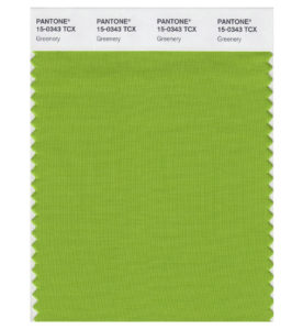
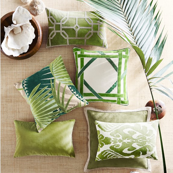
The color green has officially earned the green light from Pantone, and has been named its Color of the Year for 2017. Pantone’s Color of the Year for 2017 was recently revealed to be a bright shade of yellowish-green called Greenery.

Greenery 2017 Pantone Color of the Year
The choice of the 2017 color is symbolic. As explained by Pantone, it is an attempt to reflect the mood of today’s consumers, who are more than ever in search of revitalization and rejuvenation.

A refreshing and revitalizing shade, Greenery is emblematic of new beginnings.

Greenery is a fresh and zesty shade that evokes the first days of spring when nature’s greens revive, restore and renew. This bright, yet natural, shade is illustrative of flourishing foliage and the lushness of nature and invokes a sense of growth and renewal.

Incorporating Greenery Into Your Home

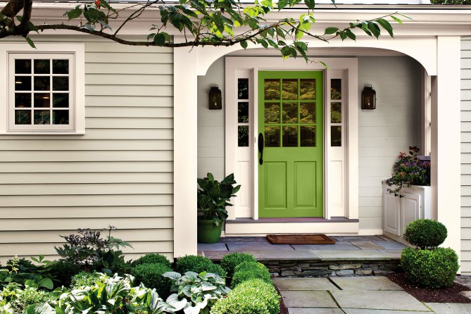
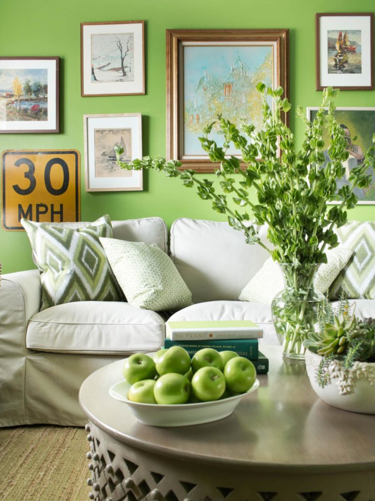
There are many different shades of green. Greenery is vibrant and verdant and characterizes the first signs of life that appear in spring. Pantone notes, “Greenery is nature’s neutral.” It’s a lively hue that channels energy, health, nature, renewal, and growth. Decorating with Greenery is sure to breathe life into any room.

antone Greenery Decorating

Pantone Greenery Decorating

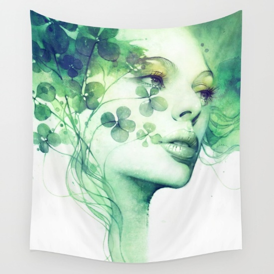
Greenery Tapestry

pantone-greenery-pillows


Greenery Elsewhere

In the automotive world, Mercedes unveiled a green car for 2018.

Green Mercedes Benz

There’s no doubt about it: Pantone chose a favorite this year with Greenery. It has the potential to breathe life into existing rooms; bring harmony and balance into a home; and lead trends in the fashion, art, and automotive industries, all of which will make it one of the more popular choices for Color of the Year.

2016 Pantone Colors of the Year

2016 Pantone Colors of the Year: Rose Quartz and Serenity

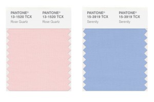
Each year, the Pantone Color Institute announces a new color that sets the trends in fashion, decor, and interior design. This year Pantone has taken an unprecedented step in choosing not one – but two complementary colors for the upcoming year. For 2016, Pantone surprised everyone with its choice of two colors: Rose Quartz and Serenity. The biggest surprise of all was that they paired the two together. It won’t be long before we see these pastel colors trickle into our daily lives. The colors are set to take center stage within fashion, beauty, fragrance, and home interiors in 2016.

2016 Pantone Rose Quartz and Serenity

After last year’s Color of the Year – the dark and earthy Marsala – Rose Quartz and Serenity are a refreshing change. These colors are a sharp turn after several years of bold colors such as Radiant Orchid, Emerald, and Tangerine Tango. Evoking a sense of calmness, fluidity and balance, the fusion of these shades provide the perfect antidote to busy modern life.

The choice of the 2016 colors is symbolic. As explained by Pantone, it is an attempt to reflect the moods of today’s consumers, who are more than ever in search of life balance, calmness and well-being. The pairing of Rose Quartz and Serenity, commonly known as pale pink and baby blue, radiates a calm and relaxing atmosphere and is an antidote for the modern-day hectic lifestyles.

These peaceful pastels offers a harmonious blend of warm and cool. The colors balance and complement each other but blend beautifully. Rose Quartz is a gentle tone that conveys compassion. It’s the color of flowers and blushing cheeks. Serenity, on the other hand, is airy like the expanse of the blue sky. It brings feelings of relaxation even in tumultuous times.

2016 Pantone Rose Quartz and Serenity

When combined, the colors look like something you’d pick to paint the walls of a nursery, which is exactly what Pantone was going for. But, this doesn’t mean you need to decorate your home like Barbie’s Dream House. When you use these pastels, there are subtle approaches that you can take to incorporate these shades into your interior design.

Decorating with Rose Quartz and Serenity

How is Each Year’s Hottest Hue Chosen?

The criteria for selecting Pantone’s color of the year is not an easy task because the shade needs to work worldwide. This makes the selection process a difficult task.

The color of the year requires careful consideration. Trends are rarely decided by individuals. Instead, they are decided by a committee. One of the most influential committees is a group of 10 people whose names are secret. They meet in Europe twice a year at the invitation of Pantone, a company based in Carlstadt, New Jersey, whose only business is color. This committee of experts formed by Pantone spends months studying the shades used most in the various art disciplines, design, and even the entertainment industry. This first analysis yields a color family, which must also reflect an attitude and a general mood. From there, they go on to select the winner.

In conclusion, the possibilities are endless when decorating with these trendy hues. It’s just a matter of time until the design and fashion industry respond by incorporating these shades into their paint color palettes. In fact, today I was out shopping and have already begun seeing these shades in stores and magazines. Of course, consumers can either go with the trend or wait for a new year.

The Importance of Professional Networking
Importance of Professional NetworkingThe Importance of Professional Networking

You open your inbox and there is an invitation to attend an event or alternatively, you receive a formal invitation in the mail. So you gingerly place the invitation on the side or in a pending file, or you may even throw it away without a second glance. If it’s an Evite, you may respond and say you cannot attend. But you’ll never know what opportunities may have awaited you.

My professors and bosses have always stressed the importance of networking, and I couldn’t agree with them more. The old saying, “It’s not what you know, it’s who you know” holds a lot of truth.

Here are some reasons why professional networking is important:

Developing Relationships is Critical to Success
Developing and cultivating relationships is critical to success. People do business with those they know, like, and trust. It takes time, energy, and effort to build a network. Through building that network you develop and cultivate relationships with people who know you, trust you, and will do business with you.

Increases Your Chance of Getting a Job
In today’s current economic climate, the job market is very challenging and competitive with going up against potentially hundreds of other candidates for a single position. Constant rejections and lengthy interviews can sometimes mean that your face becomes just another in the pile. Just as networking with specific businesses can help you find your next job, so too can networking with industry recruiters. Often employers and industry recruiters have the inside scoop on possible new job openings before they are advertised. Employers prefer to hire based on referrals or recommendations which people in your network can provide. Managers and recruiters looking to fill a position will first search their own networks for candidates before the job goes public. Gaining access to these key players and hiring managers is tied directly to your network.

Increases Confidence Levels
Networking increases confidence levels because it will help you to push yourself to talk to people you don’t know. We cannot build strategic partnerships or social relationships unless we communicate. No matter what walk of life we pursue, we need to be able to break the ice, approach strangers and start, build, and maintain conversations. The more you do this, the easier it will become.

Allows for Visibility and Presence
Networking allows you to be visible and present. Instead of hiding in your cubicle or office, networking ensures that you are visible so the people in your organization know who you are. In each of my positions, I actively networked at all levels in the organization in order to develop positive relationships and create value for others in the company by being knowledgeable, reliable and a supportive person. Being visible and getting noticed is a big benefit of networking.

Who Should Be In Your Network?

Build Your Network

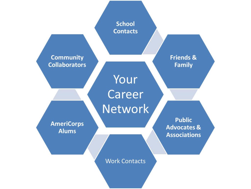
Your network can be made up of almost anyone you’ve ever met and each of your contacts can lead you to new ones such as:

  • Current and Former Co-Workers: Those you currently work with as well as those you’ve worked with in the past can be part of your network.
  • Your Co-Members in Professional Associations: When you become an active member in a professional association, you will increase your chances of meeting people. It will also give your colleagues a chance to see you in action.
  • Friends and Family: Keep your family and friends apprised of your career goals. You never know who will end up having the ability to help you.
  • Former Professors and Instructors: Your former professors and instructors most likely worked in your field or at least have some connections.
  • Former Classmates: The alumni directory of your college can provide you with contacts to add to your network.

In conclusion, when your invitation arrives, gladly accept the invitation, and attend the event. These events give us a chance to meet new people and cultivate lasting relationships. With practice, you will be able to mingle while increasing your confidence level.

The Importance of Color

Importance of Color - Branding

The Importance of Color

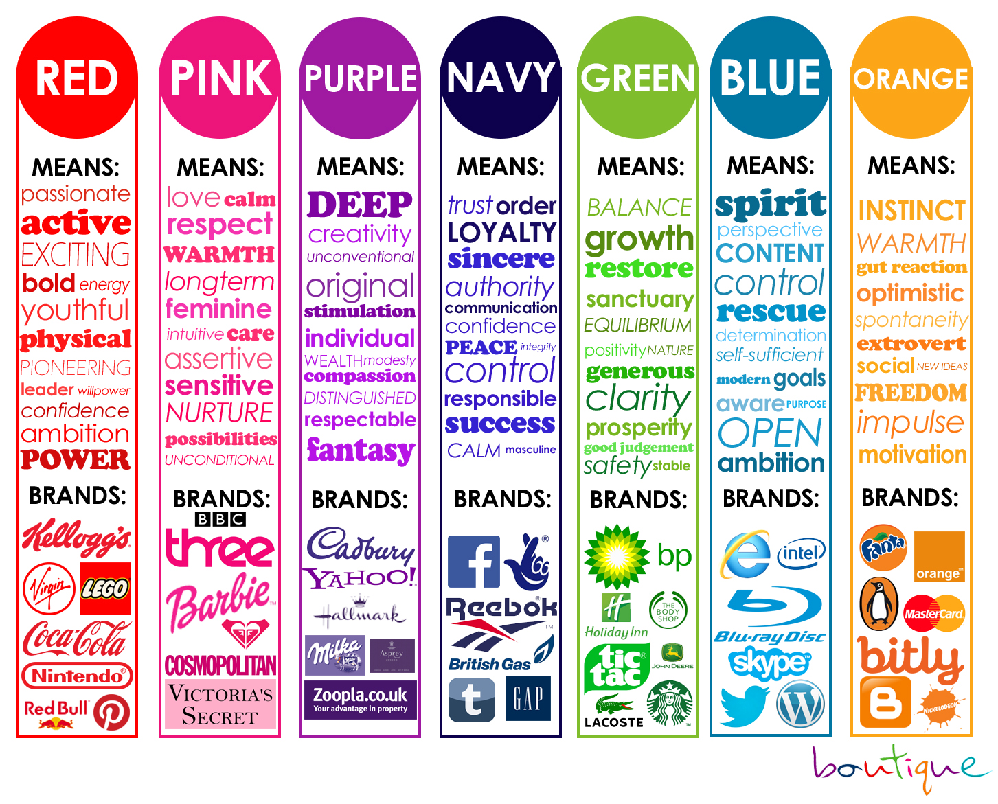
Color is an important element in marketing, branding, web design, or even interviewing for a job. Research has shown that people react differently to colors. Color can sway thinking, change actions, and cause reactions. It can soothe, raise your blood pressure, or even make you hungry. You can drive almost anywhere and assume that a traffic light has red, amber, and green; that red means stop and green means go.

Colors can evoke connotations like aggressive, soothing, cheerful, luxurious—and those connotations differ across cultures.

Color is a powerful form of communication.

Color and its Meanings

Black is a mysterious color that signifies power, strength, authority, and commands respect. It is simple, elegant, and speaks of class.

Blue is a favorite color for businesses and suggests stability. It inspires confidence and is the second most powerful color. Darker shades of blue represent authority while brighter hues signify trust and security. Paler shades imply peace, loyalty, and wisdom.  Blue causes a calming effect.

Gray is a cool, neutral, and balanced color and is associated with conservative qualities and considered traditional, business-wise symbolizes high-tech and suggests authority, practicality, earnestness, and creativity.

White is the color of innocence, cleanliness, purity, and neutrality. For this reason, many websites use white as a background. It is considered to be the color of perfection. White is a brilliant color and works well for contrast but, that same brilliance can make white hard to focus on and may cause eye fatigue and can be blinding at times.

Brown is an earthy color and is often associated with nature, warmth, and coziness. It suggests richness, stability, reliability, dependability, and approachability, and wholesomeness.

Red signifies power. It’s an emotionally intense color that ignites thoughts of love, passion, and danger. This can have the effect of raising blood pressure. In contrast, red is also the color of alarm and is used as a shorthand sign for danger.

Green is associated with the color of nature, good health, and money. It is seen as calming and is associated with many foods.

Yellow is an energetic and bright color. It represents sunshine, happiness, and warmth. Yellow is associated with creativity and is one of the most difficult colors to focus on visually.

Orange exudes confidence, cheerfulness, hot, fiery, and excitement.  It’s often associated with vibrancy, tropics, and instills a sense of fun and pleasure. Orange appeals to a wide range of people.

Purple is often associated with royalty, nobility, luxury, power, creativity, and ambition. It conveys wealth, extravagance, and creativity.

Color matters and is definitely something to consider whether you’re going on a job interview, designing a website, a logo, or marketing a product.

Powered by WordPress & Theme by Anders Norén